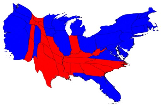
In my opening lecture in the level 2 module Political Geography, I regularly use US presidential election maps. I generally start with 2000, 2004, and 2008 and talk about the swing states and geographical areas that seem clearly demarcated. But then I jump back to 1970 and work through all the elections which complicates this story and shows the emergence of a relatively recent trend. I then play around with maps where the size of states are adjusted for population or electoral college votes; ones with graded shadings instead of just red or blue; and ones with county divides instead of the whole state. I then use three-dimensional maps by population, and a map of electoral districts in Ohio and Columbus. There are loads of maps online to help with this. It’s only an introductory lecture, and only an illustrative example, so I don’t go into huge detail. Doing the rounds on facebook are these two images of the 2012 election. The first is adjusted for population.
The second pairs 2012 with 1846.
You could begin some good discussions with this, and the distortions of both maps.
Discover more from Progressive Geographies
Subscribe to get the latest posts sent to your email.


