
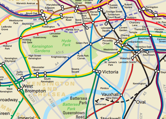
While the standard TFL map is a model of a functional map – all straight-lines and angles – it can sometimes mean that people take journeys that would actually be faster above ground.
So, someone asked TFL for a ‘geographically accurate tube and rail map‘ of London, and this is what they got. Click through for the full thing [pdf], but the part above of central London gives a good idea. It shows the as yet-unopened Crossrail (Elizabeth line) in dotted purple, and the Northern line spur to Nine Elms and Battersea (dotted black).
Discover more from Progressive Geographies
Subscribe to get the latest posts sent to your email.


