
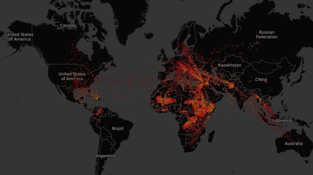
Refugee movements visualised, 2000-16 – at mashable
An interactive visualisation – perhaps a good basis for class discussion.
 Thanks to dmf for the link.
Update: Phil Steinberg has pointed me to a 2015 post in which he explored some of the problems with an earlier form of this visualisation.
Discover more from Progressive Geographies
Subscribe to get the latest posts sent to your email.


….but a problematic visualisation as well. See comments on an earlier version at https://philsteinberg.wordpress.com/2015/10/29/visualising-the-migrant-swarm/ .
Reblogged this on Progressive Geographies and commented:
Now with a link to Phil Steinberg’s critical commentary.